"Don’t stop me from having a Helvetica good time!"
“Comic Sans walks into a bar. The bartender says ‘We don’t serve your type here.’!”
These are two of my favorite font jokes (of the many I enjoy). Fonts are like different translations of the bible, some people believe only one style is the ultimate font and all others are wrong.
This is far from the truth. Fonts come in so many different categories:
There are so many different fonts available to designers for free. With that being said it can get very overwhelming to decide which fonts to use. I am guilty of sticking to only three fonts I like that cover the top three categories stated above to where I never change them. When I should be taking advantage of the unlimited design treasure that lies in using different fonts.
You can stick to one category of fonts and still get a variety of looks. Here are some examples:
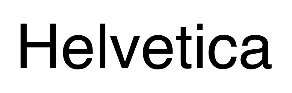
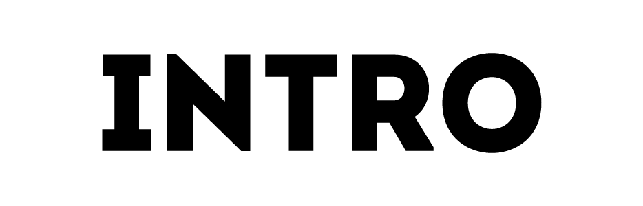
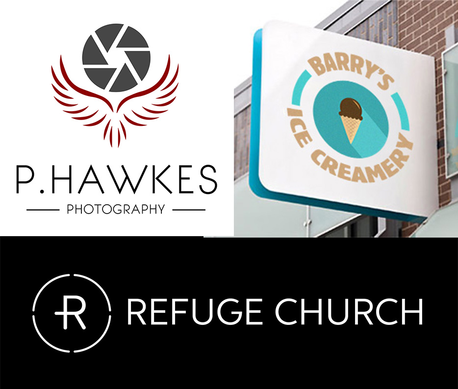
As you can see with the two Sans Serif fonts, they may be the same category but look very different. Sans Serifs are most popular with graphic design projects like logos and web design. They are clean and geometric making them great for adding other design elements to them. When I am working on a logo design, after I decide on the font I will usually convert it into a shape so I can mess with it and see if I can add any other vector objects into it to make it more a part of the design. With the three logos I have below they all have some type of brandmark with text to make a logo. Something I struggle with is making the brandmark and logo text connect because it is really easy to make a nice brandmark and then add a cool font to it, but combining the two so they work together can be a challenge.
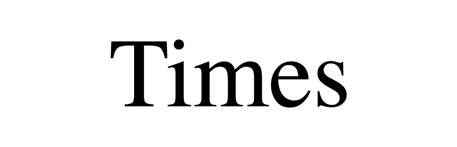
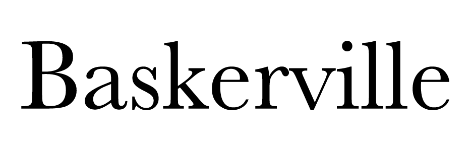
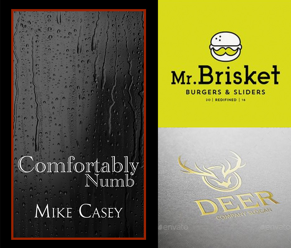
Same principle goes for the Serif fonts above. Times is one of the most common fonts used for scholarly papers but other serif fonts can be used in design to convey a more serious tone. Below I have a design I did for a book cover for our Recovery Pastor and two logo designs I found online. The book cover was for his autobiography, which coming from a previous heroin addict, was pretty intense. So I went with a modified serif font to convey a more serious tone to the book. The two logos show some other uses of serif fonts for logo design purposes.
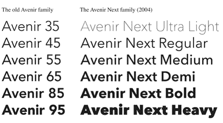
I personally love Sans Serif fonts. One of my favorite is called Avenir. I use it for personal branding and love that it has so many different weights (ie. light, medium, oblique, black, bold, etc.) to it that this one font can be used in so many different mediums.
So, why do I talk so much about fonts?
With the wrong font choice you can send the wrong signal to your consumer. A good designer can take the most popular fonts used and put them in compositions and make great images. But a great designer will constantly try new font choices and push the standards to create something new and unique.
Below are links to some free font websites I frequently use:
I also realize a tension point is finding cheep or free fonts to use for commercial use. I realize the above links may not work for those professioanls. In response to that there are a few links below you can go to that have great libraries of fonts to use. One big resource is Adobes' Typkit. If you are a creative you probably subscribe to the Adobe Creative Cloud system. Included in this is Adobe's Typkit rseource that has a large library of fonts for you to "sync" and add to your device to use for your designs instantly.