First question I ask myself when beginning a design project. “Do I use Photoshop or Illustrator?” Both programs can be used to complete the same goal but in totally different ways, and different optimizations.
I am very thankful to Adobe for making all their programs in their Creative Suite so uniform. Most programs have similar functions and keyboard shortcuts, so if you learn one you can navigate the others quiet easily. I wanted to give you my opinion on which I think is better at the beginning so I can get it out of the way…….its Illustrator. I really enjoy animation and clean simply vector designs, so I am more drawn to use Illustrator since I am able to replicate and create those types of designs. I did learn Photoshop first (and it took me a few years to fully understand the program) but I feel Illustrator’s UI and UX is much more friendly and conducive to designing. One major difference between the two programs is the use of layers. In Photoshop layers and required to interlay different objects on top of one another. In Illustrator you can have all your graphics in one layer and have them oriented anyway you want.
Photoshop (Ps) is a little more well known to the general public because of the phrase “that looks photoshopped”. Ps is a pixel based image (and now supports 3D and video) that is used to make graphic composite images. Pixel base means that every photo or object put into Ps is mapped with pixels. This makes it easy to take multiple images and cut and edit them to look like one image (composite). It also allows you to edit each pixel of the image giving you more control over their color, position, and more.
Now Illustrator (Ai) is very different from Ps in how you edit designs. This program is vector based meaning it doesn't draw pixels but draws vectors based on mathematics. This allows for a designer to create a flat vector design that can be scalable without the worry of low resolution.
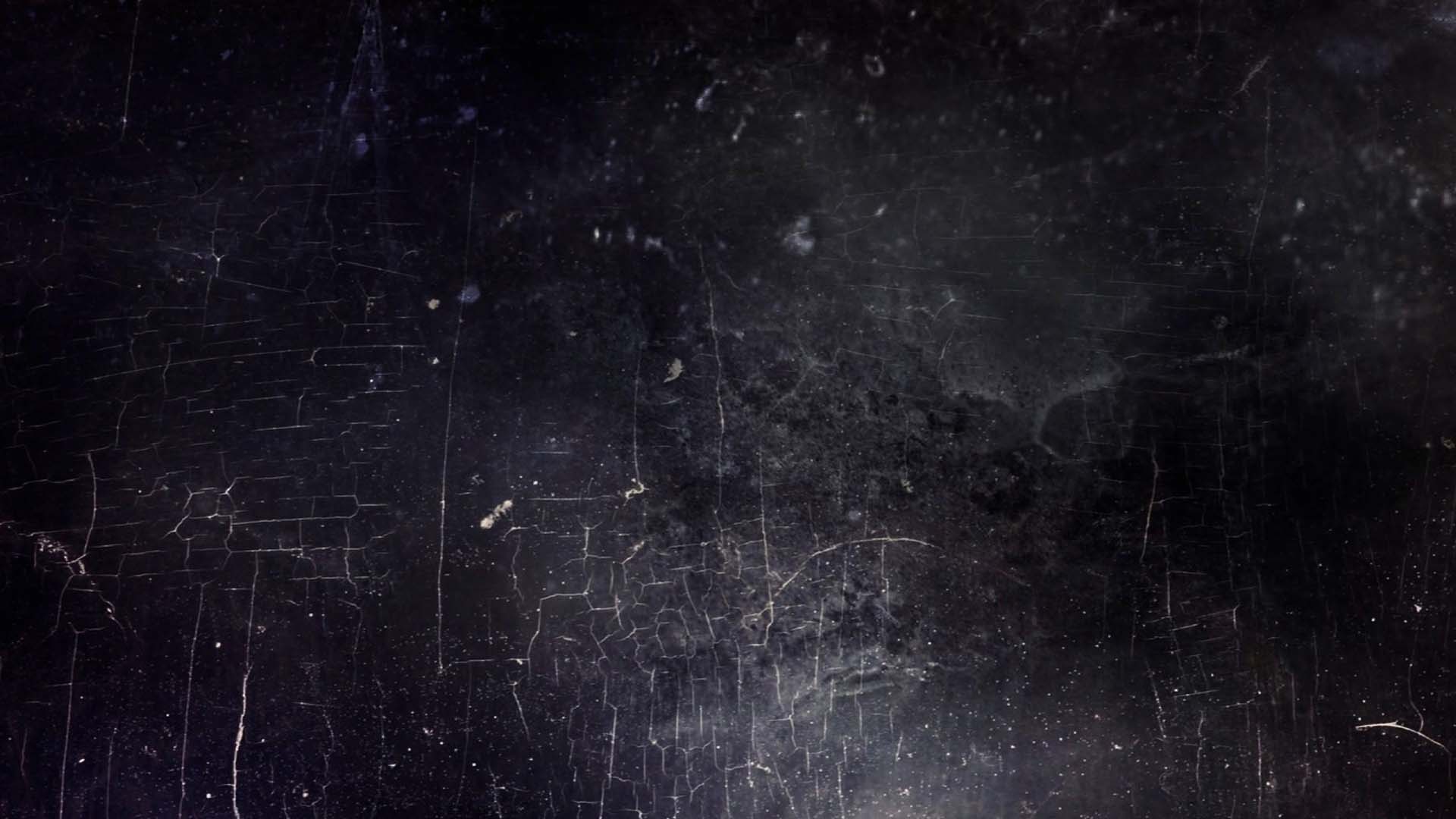
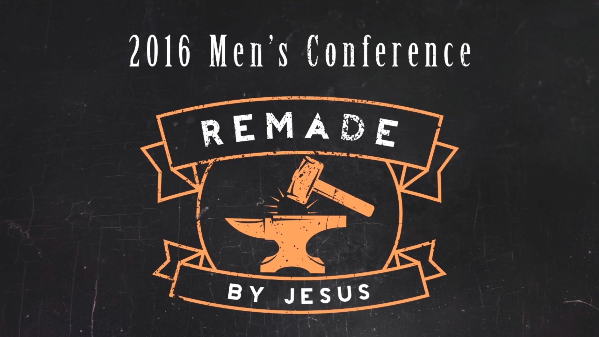
The way I have used these programs together is when I have to make a brand identity for an event or conference. I will usually begin in Ai to make some logo or icon that can be used to represent the event. Then when I am happy with the logo I will bring it into Ps as a smart object. Then I will work on making a composite background with some texture overlay to make the image feel like one entity.
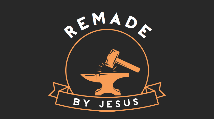
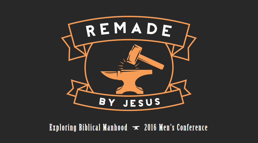
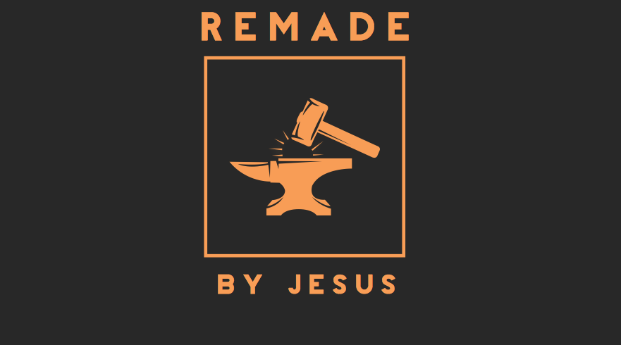
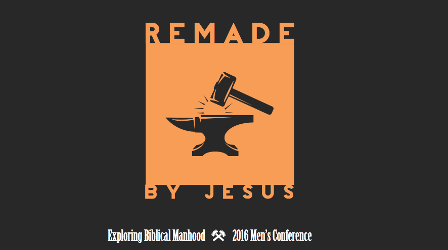
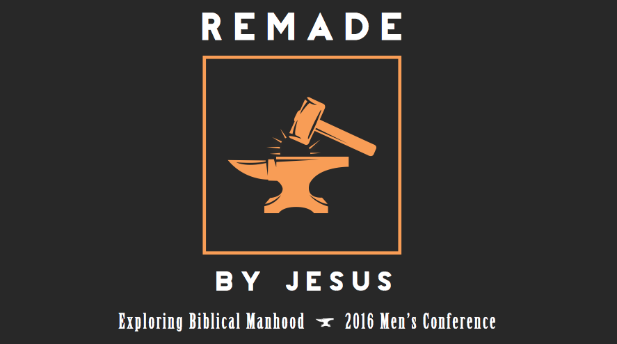
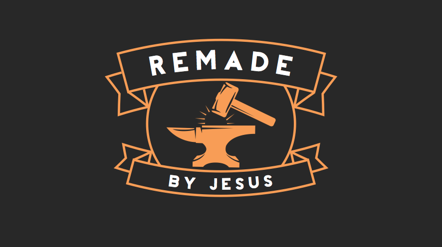
Here is an example of how I used both programs to make a branding: